Station Climate: What am I looking at?
At the top of each plot is the name of the station. This is mostly as the name appears in the original dataset.Abbrebiations like "Rgnl Ap" for "Regional Airport," or "Marco Is" for "Marco Island" are the names from the original dataset. Distances and directions from a place, like "Panama City 5N" have been made more uniform by removing spaces between the number and letter and capitalizing the compass directions.


Directly under the location is a legend. To provide some context to the values shown for each station, four ranges of data are shown for all stations at similar latitudes. This context shown in grayscale is plotted behind the station's values, which are shown in colors.Temperatures are red.
Precipitation (rain) is green.
Snow is light blue.
Amount of sunshine is yellow.
Wind speed is purple.

- The darkest gray shading in each plot shows the highest and lowest values for the five-degree latitude band surrounding the station.The station latitude is rounded down to the nearest whole number. This is the middle number of the five degree band. For example, a station at 29.69 North. This latitude is rounded down to 29 North. The five degree band includes data from all stations between 27.00 N and 31.99 N. To remove outliers, the data from all stations within these five degrees are gathered, but the gray band only shows the middle 90% of these values. In other words, the highest and lowest five percent are considered outliers and their data are not included in the dark gray band shown.If fewer than 12 stations exist in that five-degree band, then all stations are included and simply the maximum and minimum values are found. Therefore, if data from the station extends outside the gray band, then the climate for this station is quite extreme compared to all the stations at a similar latitude.
- The second darkest shade of gray shows the highest and lowest values for the thirty-degree latitude band of the Earth the station lies within.There is a catch. While gathering the data from all the stations in the thirty degree bands, the data are sorted by each degree of latitude. So there are thirty groups for the thirty latitudes, and each station goes in whatever group represents its latitude. Well, for the context to be shown, there has to be stations in at least 3 of the 30 latitudes. Otherwise, the data is not representative of the whole 30-degree range. Honestly, this is an extremely low threshold, and is another reason why these plots are not of "research quality." They are best used just to give an idea of Earth's climate. These thirty degree bands are the low latitude (0 to 30 degrees), middle latitude (30 to 60 degrees), and high latitude (60 to 90 degrees) bands in each hemisphere. Therefore, six of these bands exist. As in the previous category, the outlier values have been removed.So, it turns out the most straightforward way to remove outliers for all four of these categories often makes the resulting graph confusing. To maintain clarity, outliers were ultimately removed by taking advantage of the process used above. In that process, the maximum and minimum values for all 5-degree latitude bands on Earth were calculated. Well, the maximum and minimum values for the 30-degree range of latitudes are actually taken from those 5-degree maximum and minimum values already found. You could therefore say this step is actually a 34-degree range of latitudes. But finding the maximum and minimum values for the 30-degree range of latitudes in this way assures the context shown for this larger range of latitudes, which you would think would have more stations and a larger range of values, cannot result in a narrower range of values than its smaller 5-degree band.
For example, a station at 31.1 North latitude would have a 5-degree range between 29 and 33 North. If the maximum value for the 5 degree band came from a station located between 29 and 30 North, that station and its maximum value would not be included in the 30-degree band between 30 and 59 North. On the resulting graph, the top of the lighter gray band representing the 30-degree range of latitudes would not be as high as the darker gray band representing the smaller 5-degree range of latitudes. The way the graph looks is confusing. Even if you interpret it, the conceptual cause of this appearance is confusing. I mean, have you read these paragraphs?! So let's hide this little methodological detail and happily move on with our lives. - The third darkest shade of gray shows the highest and lowest values for the northern or southern hemisphere the station lies within.Just as above, there has to be stations in at least 3 of the 90 latitudes for this resulting context to be shown on the graph. That's all 90 degrees of latitude on the station's side of the equator. Again, outlier values have been removed.It's the same process as the previous step, but for a 90 degree range instead of 30 degrees.
- The lightest shade of gray shows the highest and lowest values for all stations worldwide. Again, outliers have been removed.
The first graph shows the climatological temperature values for the station.
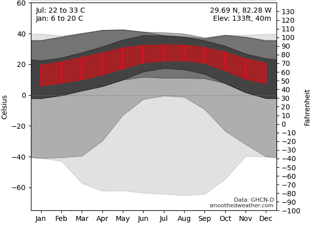
In addition to the data plotted in red and gray, the top corners of the graph display text relevant to the station. The top left of the plot shows specific temperature values associated with the warmest and coldest months of the year, and in which months they occur. Specifically, the first line shows data for the month with the highest maximum temperature over the year. The bottom line shows data for the month with the lowest minimum temperature over the year.If only the average temperature is available instead of the maximum and minimum temperatures, then only the highest and lowest average temperature is displayed.
The top right corner of the temperature graph contains additional context for the station unrelated to its temperature. The station's latitude, longitude, and elevation above sea level is given, with the elevation provided in both feet and meters.
The next graph shows the average precipitation the station receives each month.
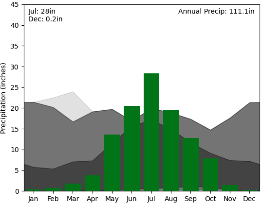
Again, the top corners of the graph display text relevant to the data. The top left corner displays the months with the most and least accumulated rainfall. Where the accumulated rainfall is over an inch, the value displayed is rounded to the nearest inch. For lower amounts, the average accumulation is rounded to the nearest tenth of an inch. The top right corner of the graph shows the annual average precipitation that occurs, and is a sum of the twelve months.
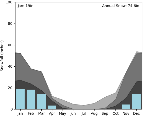
If data is available, the next graph shows the average snowfall the station receives each month. Similar to the precipitation graph, the top left corner displays the month with the most accumulated snowfall,The minimum value is zero for the vast majority of stations and occurss in multiple summer months. and the top right corner shows the annual average snowfall.
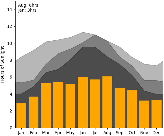
If data is available, the next graph shows either the daily average number of hours of sunshine received by the station each month or the average amount of water than evaporates from an evaporation pan. Whether directly measuring hours of collected sunlight or water evaporated by sunlight, this plot gives an indication of both hours of daylight and typical cloudiness during the day. Obviously, the number of hours of sunshine received is measured in hours. The amount of water evaporated is measured in inches. Again, the top left corner shows the months with the maximum and minimum values.
Finally, if data is available, the next graph shows the wind speed. Depending on the station, either the fastest 2-minute wind speed, fastest 5-minute wind speed, average daily wind speed, or peak gust wind speed during a day is provided. In other words, has the wind speed values from each second been averaged over a 2-minute period, a 5-minute period, or all day? The wind speed is converted to knots, which is the unit used the most by meteorologists. Again, the top left corner shows the months with the maximum and minimum values.
Where is the data from?
The data for all the stations are from the Global Historical Climatological Network (GHCN-D) dataset, and specifically the daily values for all stations. At one time, monthly values were recorded separately (GHCN-M), but this appears to have been discontinued.
How were the data used to create the plots?
The National Center for Environmental Prediction (NCEI) website says the GHCN dataset contains records from more than 100,000 stations in 180 countries and territories. That level of depth is part of what makes it useful for monitoring worldwide climate. With that said, the purpose of this website is not to show research-quality data. Instead, it is meant to give simply a good idea of what the climate is like for a large number of worldwide locations.
For a plot to be created, temperature data has to be available for at least a 20 year period. Also, 20 years of data has to be available for at least one month of the precipitation data. If there are months where less than 20 years of rainfall data exists, that month's bar is plotted in white and text at the bottom of the bar states how many years of data are available. If a station does not have temperature and at least one month of precipitation values that cover 20 years in a thirty year period, then no plot is made for that station. Considering this, there are 9024 stations with graphs on this website.5,094 are in the United States, 617 are in Canada, 518 are in Australia, 473 are in Russia, 338 are in Germany, 204 are in China.
A complication that arose is that not all data has been collected for as long as temperature, precipitation, and snow. Most stations recording the number of hours of sunlight per day have only been doing so for four years.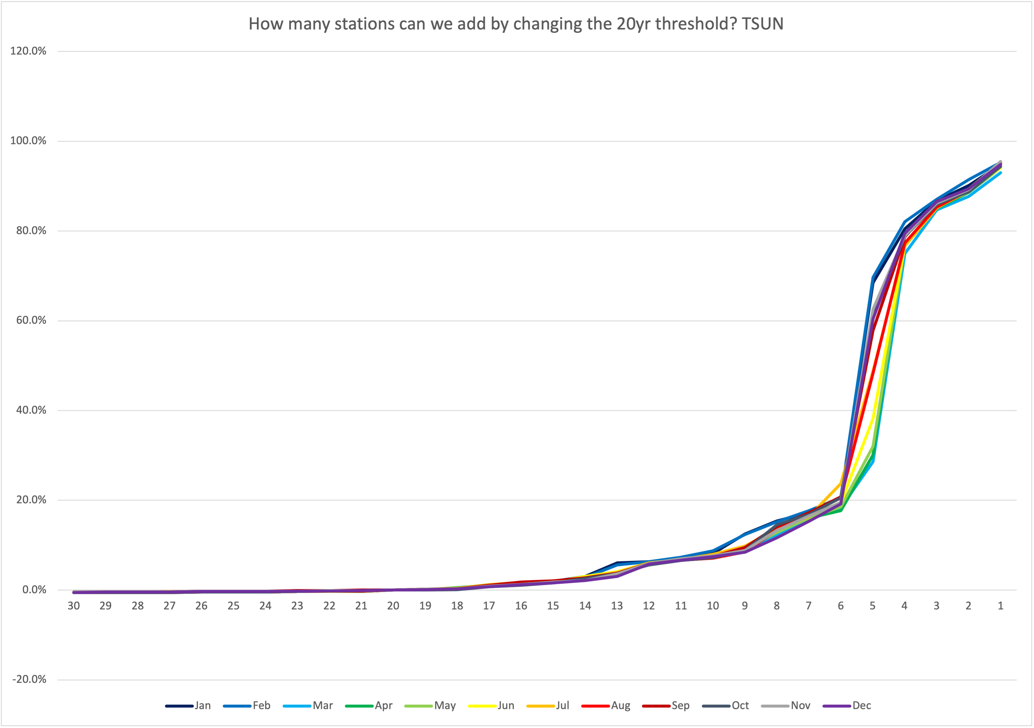
This graph was created to find how many more stations could feature a graph for hours of sunshine simply by changing the threshold for the number of years of data that has beeen collected. To determine if adjusting the threshold would be worthwhile, the y-axis is normalized by the number of stations featuring this graph using the 20-year threshold, which is a fancy way of saying this is why the y-axis is a percent. The different colors show which months contain many years of data in case a systematic trend appears. The conclusion is very few stations have been recording this data for even 6 years, and almost none have done so for 14 years, much less 20 years. Most stations recording wind speed gusts have only been doing so for six years.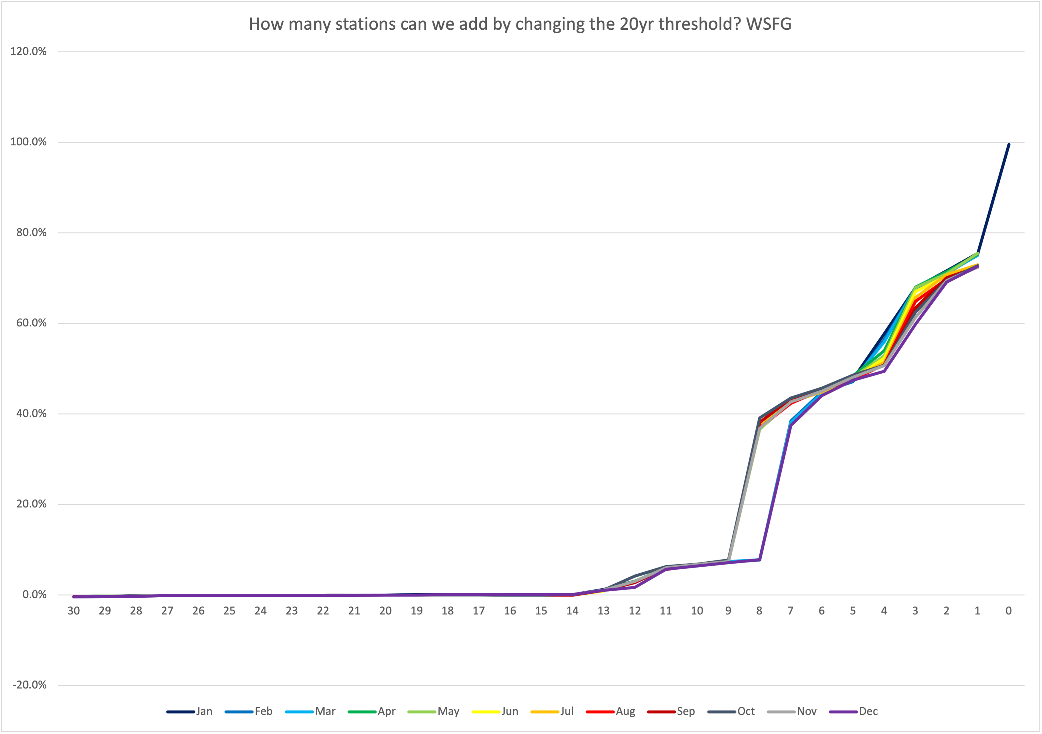
Very few stations have been recording wind speed gusts for 9 years, and almost none have done so for 13 years. There seems to be a systematic bias where wind gusts were recorded during the summer but not the winter months, perhaps due to frozen instruments. Most stations recording evaporation of water from a pan have only been doing so for fifteen years.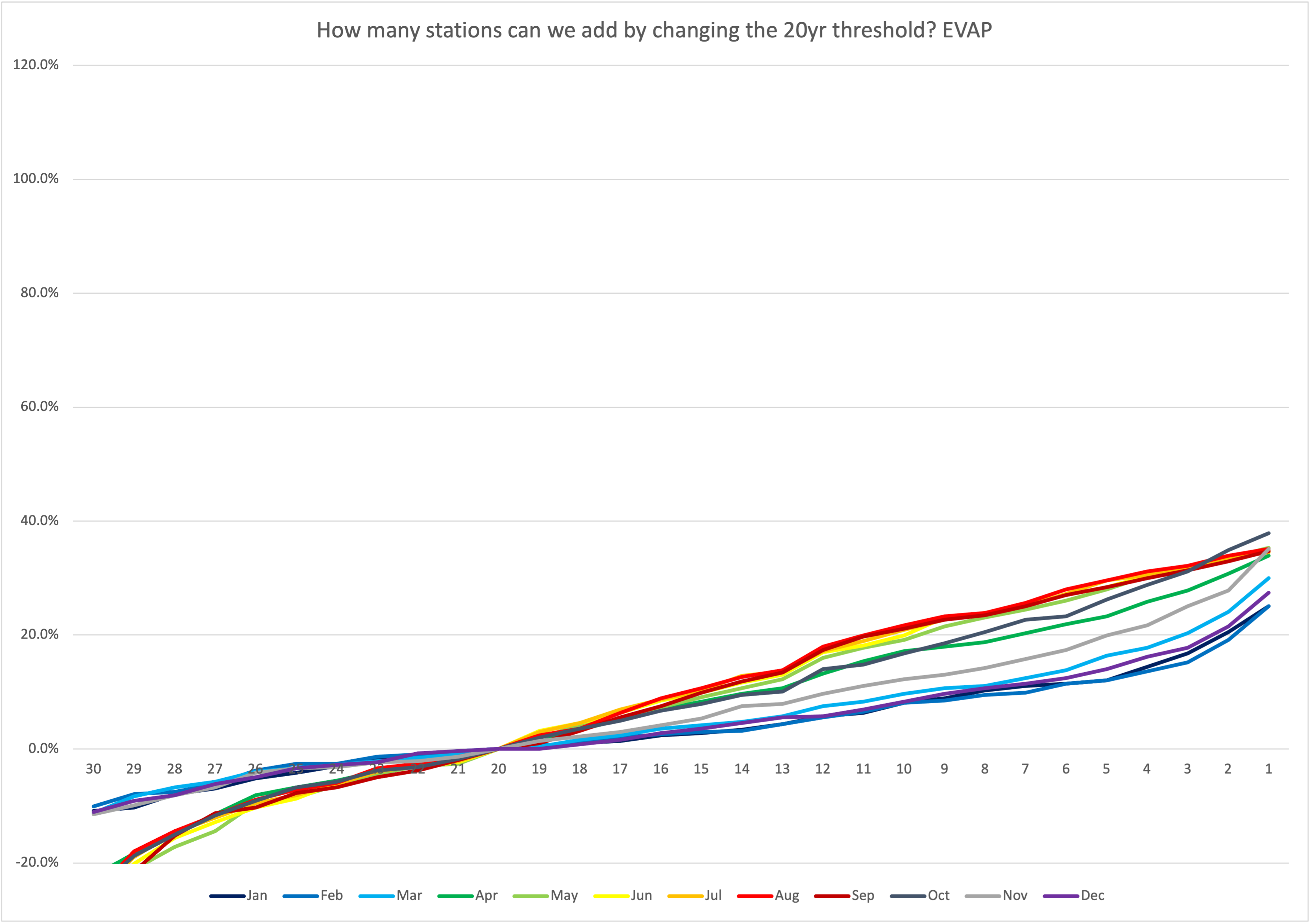
There is not a clear drop off to indicate when data collection for water evaporation clearly began. But more data is clearly available in the summer months, likely because water may freeze in the winter. Therefore, requiring a minimum of 20 years of data for these measurements would result in these plots being very rare. It would also make the concept of regional and worldwide comparisons impossible. So lower thresholds of 4, 6, and 15 years were used for these three datasets. Undoubtedly, fewer years of data means there is more noise in the data, but it's better than no data at all.
Another complication arose with snow data. Stations at high elevations systematically recorded more snowfall because it was more likely for their temperatures to be below freezing. In addition, we know mountains can lift the air and aid the generation of clouds and precipitation. Therefore, the gray context bands for the snow graphs were different depending on the station elevation. A threshold of 1500 meters (4912 feet) was used to divide relatively low elevation and high elevation stations.